Like any franchise in NFL history, the Denver Broncos have had a few different logos and uniforms throughout the years. That said, unlike some of the others out there, they have had relatively few, comparatively speaking.
The Broncos have been pretty consistent going back to 1970, sporting just four logos in that time. Let’s take a closer look at the history of the Broncos logos, including the color scheme, and how the franchise performed during that time.
Denver Broncos Logo History
There are but four logos in the history of the Denver Broncos. Two of those logos lasted less than a decade, cumulatively, giving way to the two logos most famously associated with the franchise. Let’s look at each of the unique logos and see what they were all about.
The Bucking Bronco Part 1 (1960-1961)
The Broncos were formed prior to the 1960 season, then a member of the American Football League. The team would eventually join the NFL as part of the AFL-NFL merger, running a fan contest to name the team for the first time.
Landing on Broncos, the choice harkened to a focal point of the state of Colorado. The state had a rich history of cowboys and ranching, so a wild, untamed horse seemed like the perfect fit for this upstart franchise to go with.
From the start, the logo and uniform looked similar to many around that era. Rather than the famous blue and orange that we became familiar with, the Broncos uniforms were brown and yellow. The logo, featuring a cartoonish cowboy riding a bucking Bronco, was also in the yellow and brown style.
The logo would last just two years, however, and is largely forgotten by Denver fans. It would give way to the second era of logos in Denver Broncos history, though the change would not be quite as large as it would initially seem.
Broncos should use the bucking bronco logo at some point . I don't understand the hate it gets and it's definitely the most underrated logo. https://t.co/2vyosevqz3 pic.twitter.com/8t8Ia6b7Tj
— Jordanthelam19 (@jordanthelam19) June 9, 2022
The Bucking Bronco Part 2 (1962-1967)
Beginning with the 1962 season, the Broncos were very bad. While there wasn’t an expectation of major changes on the field, there were going to be changes as far as the look and feel of the franchise going forward. The logo and uniforms were to get a makeover.
Beginning with the 1962 season, the Broncos would sport the famed orange for the first time. The logo on the helmet would look a little different than the actual team logo. On the helmet, a blue, cartoonish bucking Bronco stood alone on a background of orange.
The main logo featured a similar-looking bucking Bronco, though this one looked a bit more fierce than its predecessor. The Cowboy looked more ominous as well, standing upon the back of the Bronco and tightly holding its reins with a football in the other hand.
It was during this time that the team made the move from the light orange jerseys and helmets to the sharper orange uniforms and blue helmets (even going without a logo on the helmet in 1967. It would lead to the biggest change in franchise history at that point, and a look that would become iconic for not only Denver fans but the NFL as a whole.
The Denver “D” (1968-1996)
With the start of the 1968 season came yet another change for the Broncos. The third logo in just eight years, this would be the logo that would stick. The famous block “D” with the snorting bronco in the middle would become the look for the franchise for more than 25 years going forward.
The Broncos would adopt their famous orange and blue look at this time as well, a look that would largely remain the same from 1968-1996. The orange jerseys featured white lettering and numbers, with a blue helmet that featured the “D” logo and orange/white striping down the middle.
The “D” became associated with Broncos football clearly from that point forward. The team would make a minor change to the logo in the early 1990s, making slight changes to the snorting bronco while retaining the bulk of the look.
With this aesthetic, the Broncos would go to four Super Bowls, unfortunately losing all of them. Fans of both the franchise and the NFL will no doubt remember quarterback John Elway sporting the blue and orange while becoming one of the best players in league history.
Pretty neat to randomly run into Arleta Pech, the artist that created this Broncos logo for Decals, Inc. in 1969.
Loved learning the history of it all. pic.twitter.com/ljhFLmDehH
— Justin Michael (@JustinTMichael) July 3, 2023
The Raging Stallion (1997-present)
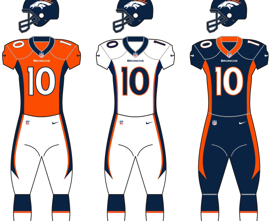
Prior to the start of the 1997 NFL season, the Broncos would see their last dramatic change for the time being. Gone were the royal blue and orange. With it went the famous “D” logo. In came a dark navy uniform and helmet with a slightly darker, almost burnt orange coloring.
More importantly, the raging bronco head with its flowing orange mane became the featured logo. That has been the look ever since and the Broncos have enjoyed their greatest success. The look was meant to modernize the Broncos at a time when teams were updating their uniforms.
The striping associated with the logo was gone, replaced by an abbreviated orange streak down the center of the helmet. The logo has remained the same since, though there have been some uniform changes of minor noting.
The move has been a welcome one, for the most part. The team won the Super Bowl three times since making the move, losing a fourth to the Seattle Seahawks. Most famously, Broncos icon John Elway sported this look during the first two seasons of its existence, which not-so-coincidentally wound up resulting in back-to-back Super Bowl championships, the first two in franchise history. When the next change will come, no one knows.
"We went all out on him. He's basically brand new."
The story of Bucky and his return to @EmpowerField » https://t.co/IVaQFa5dki pic.twitter.com/YIXwP36dMA
— Denver Broncos (@Broncos) May 19, 2023
Conclusion
The Broncos, relatively speaking, have undergone very few facelifts in the history of the franchise. The orange and blue look from 1970-1996 is one of the most iconic in NFL history. That said, the look they adopted beginning in 1997 has become the most successful in franchise history, and one they are likely to stick with for a long time to come.
